Phoenicopterus Rex was a major milestone in my life, marking the first time since college I was able to work on art full time. I had made a sculpture for Burning Man before, but nothing on this scale and most certainly nothing this far outside of my comfort zone. With friendly encouragement, the project grew in size and scope, I recruited friends and networked, building a team that would eventually become Looking Up Arts Foundation.
We were deep in production mode building Rainbow Bridge and some placeholder branding was done. From the placeholder I was given, I gave it eyeballs to make it a little more fun, but it would be months before I would have the opportunity to tackle the project. When the dust cleared and Rainbow Bridge was stored away I took to rebranding.
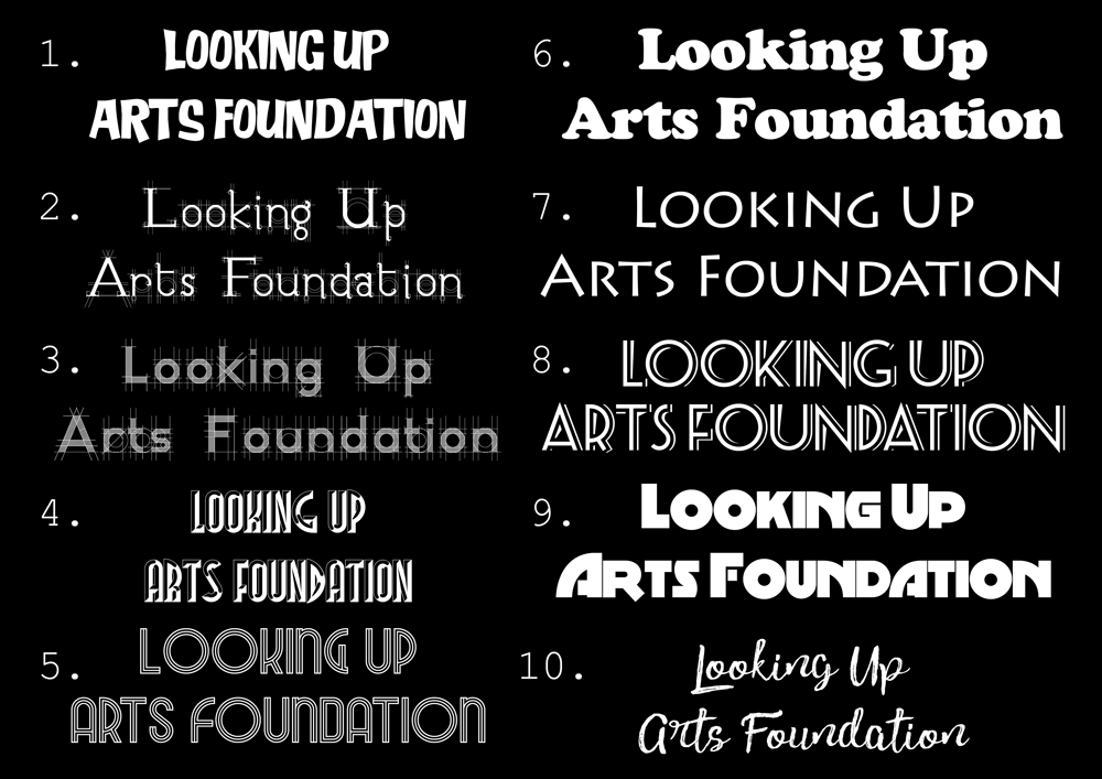
There was pressure to keep the placeholder as is and round it out with the additional text. I was looking at art deco fonts, architectural fonts, and handwritten fonts, trying to find a way to add character to the logo. The first iterations focused heavily on architecture and engineering, but I felt that they were missing the spirit of what the team was about, which was fun, challenging, positive, and ambitious work.
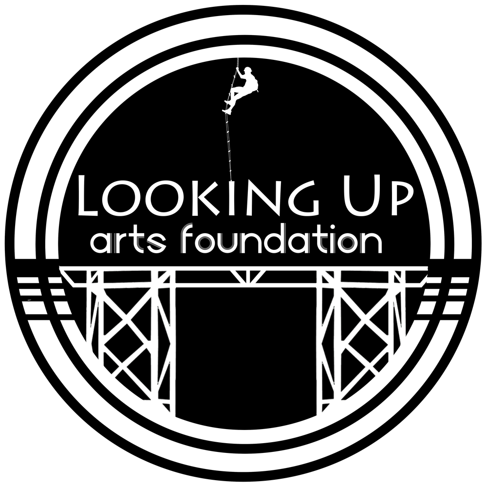

We needed a “square” logo for stickers, social media, and marketing materials, and a “rectangle” for letterhead, website, and more formal applications. I roughed these two out, using the iconic photo of Chase. Although the climbing aspect of Phoenicopterus Rex was one of my favorite parts, it felt like we were pitching ourselves as a scaffolding or climbing company. The varied fonts were cluttered, and it was getting muddied and confusing. Trying to define art, let alone distill it into a logo was proving challenging and I decided to go the opposite direction all together. I dropped imagery and began focusing on text alone.
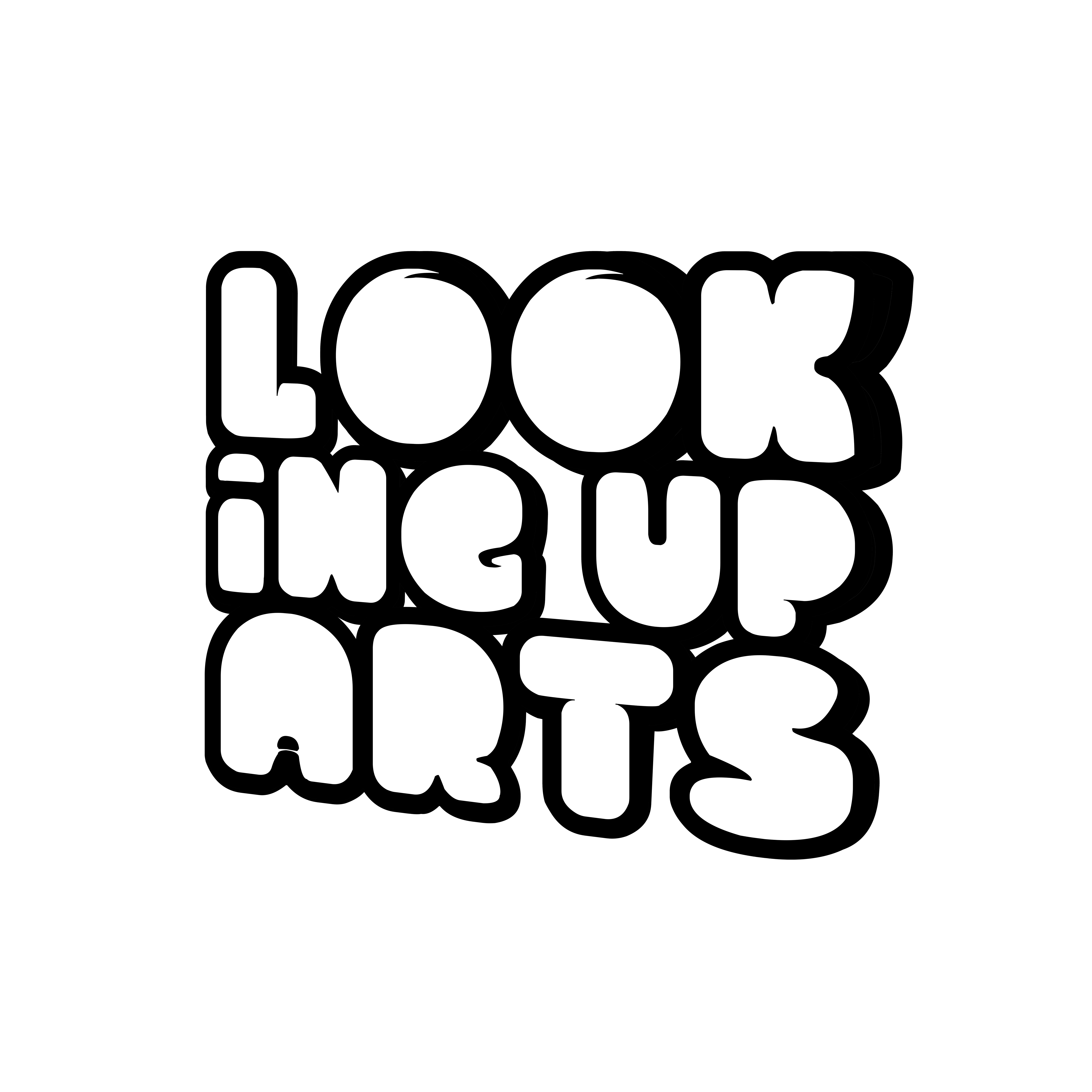
I began focusing on quirky, fat, and bold fonts. I enjoyed the dynamism of the handwritten fonts, but the were too informal. The script fonts were elegant and had energy, but overall were hard to read. The final font was fun, bubbly, it occupied a lot of real estate, but somehow felt light. I started down the rabbit hole of trying to find a “square” logo for this font.


I was smitten. It was cute and bubbly, not overly wordy. It was bold and unique, but somewhat familiar. I searched online and couldn’t find anything substantive on any other LUAFs, so maybe we were onto a unique name. LUAF didn’t sound like any word I’ve ever seen and I was already dreaming up nicknames for employees when I presented this to the board and received new direction.
- LUAF is too ambiguous
- The full name isn’t necessary
- LUAF was an unpleasant sounding word
- The rectangular logo was a hit right away

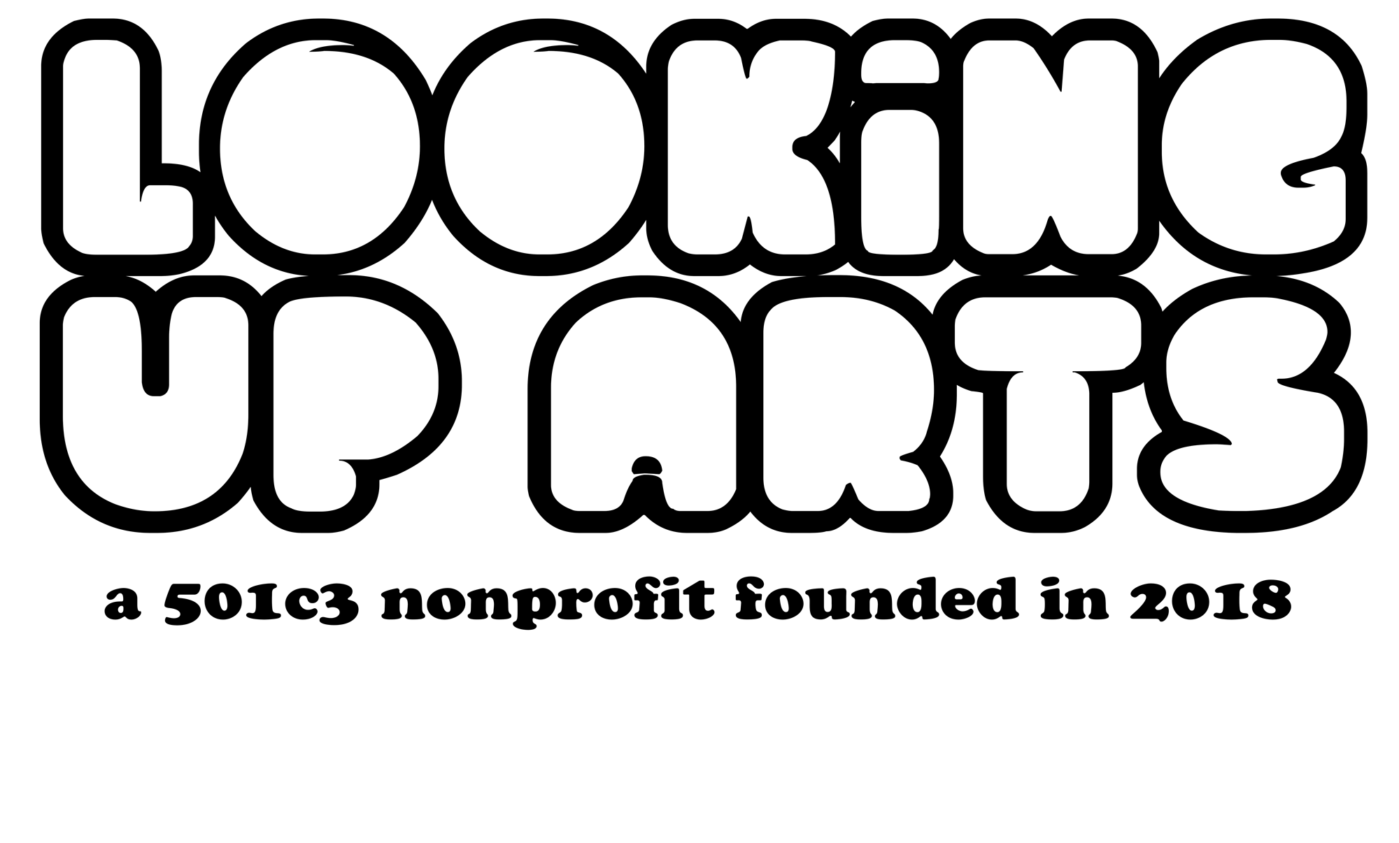
I dropped the “Foundation” and started working with the byline, but overall it was feeling too wordy. The playfulness of the lowercase “i” was striking. I tried skewing and playing with proportions to add dynamism to the logo. I began trying to make the logo a square and adding unconventional line breaks to split of the text.
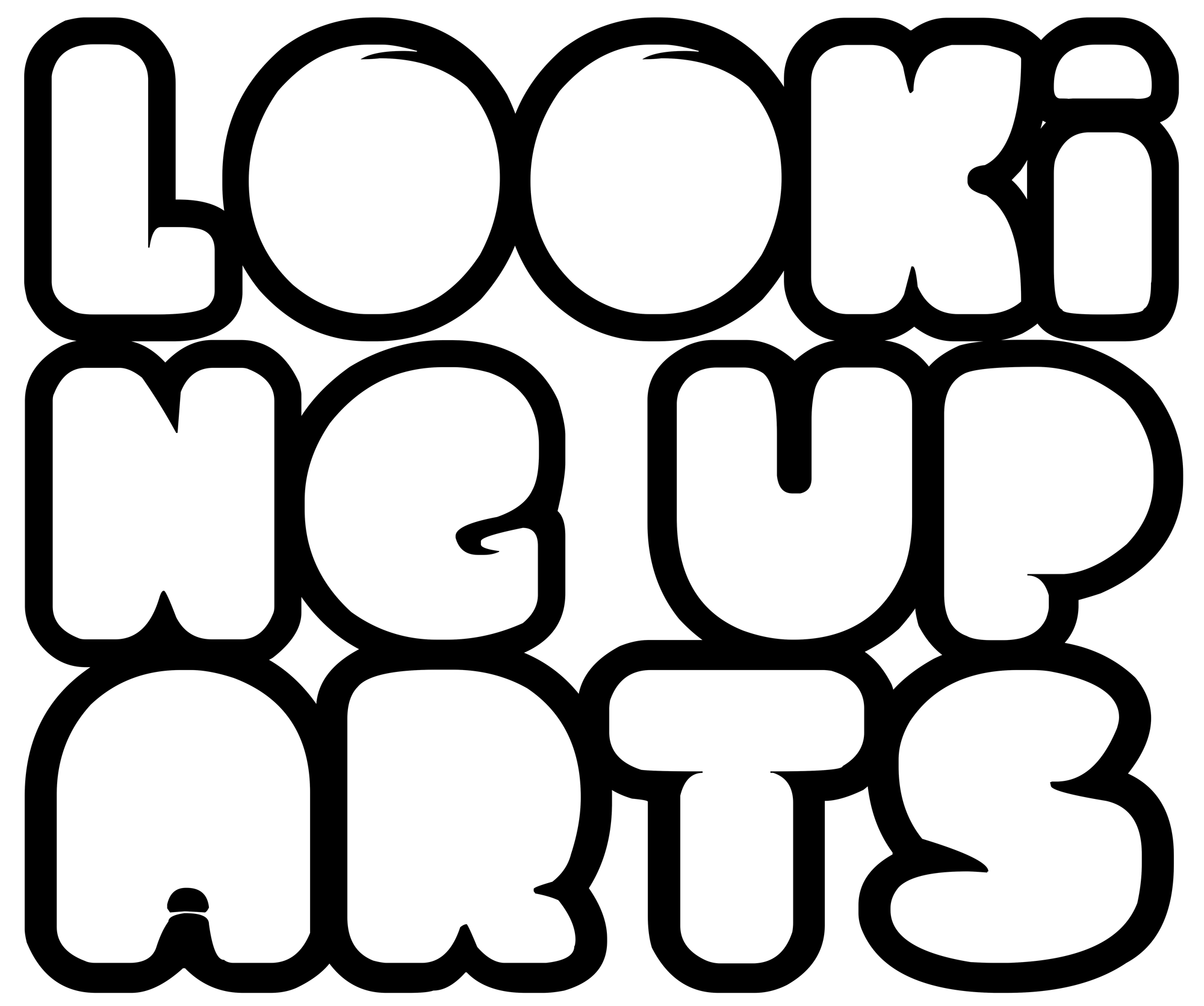


I had finally found something that was fun, simple yet complicated, and bold. I added some shading to make it even more dynamic and balance out the weight.
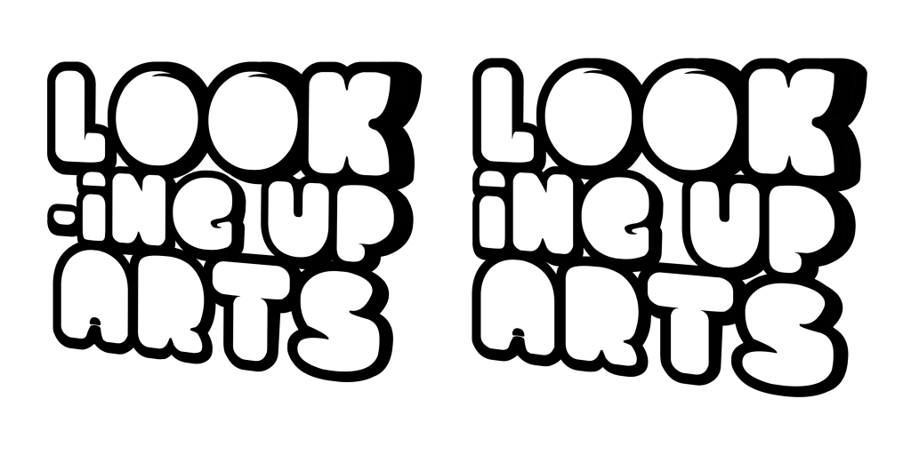
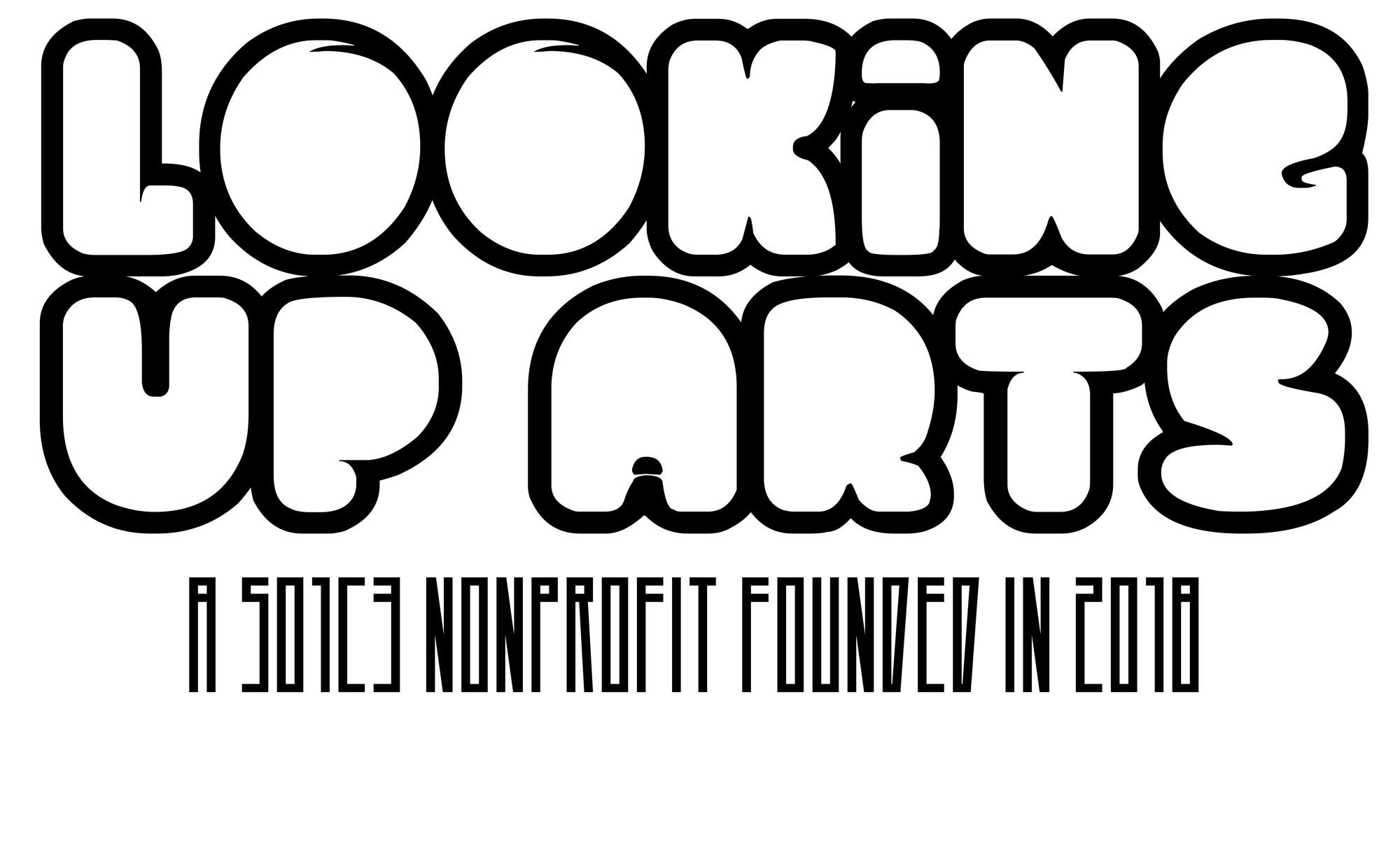
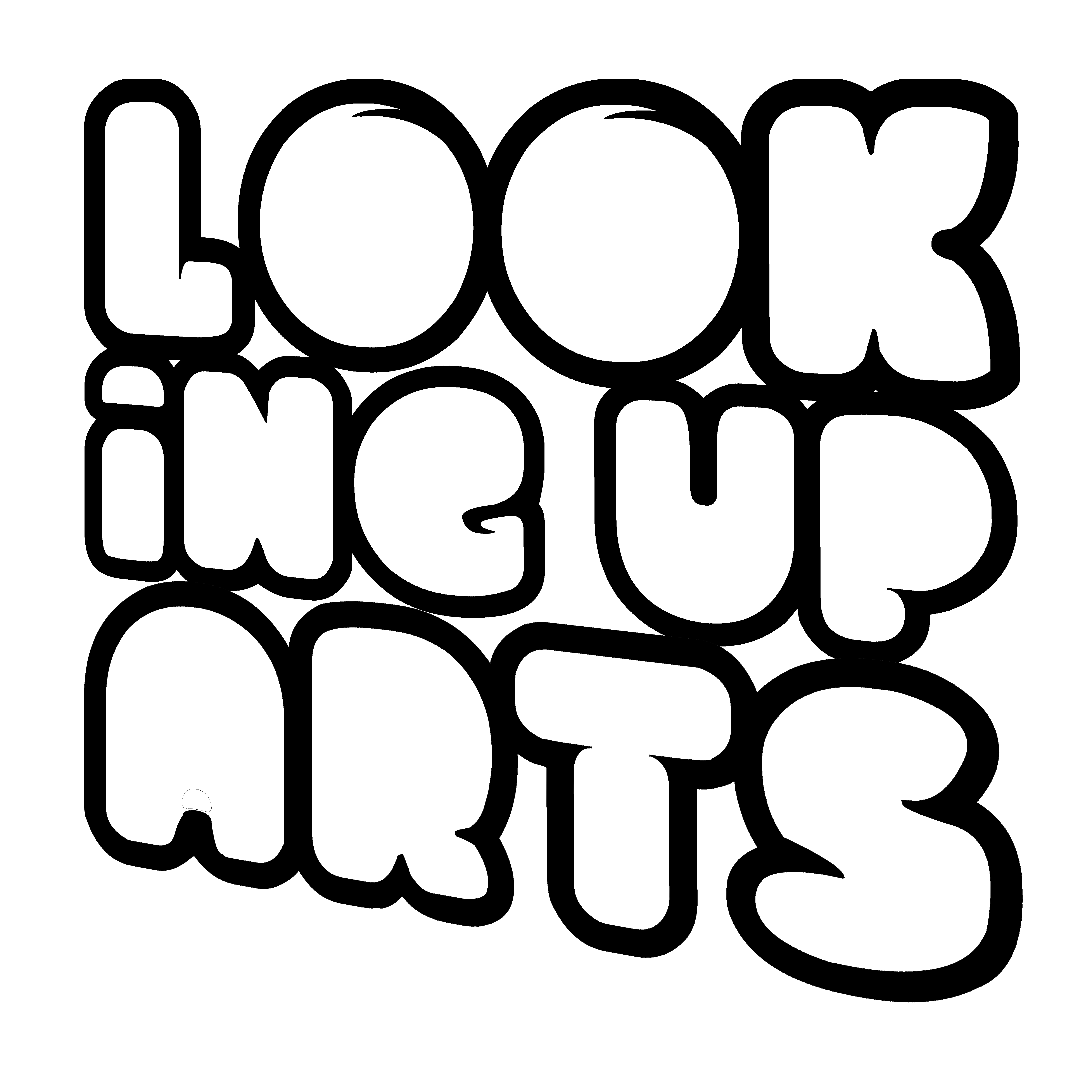
I made a hyphen since this font didn’t have one. I thoroughly enjoyed how the “O” reminded me of the original placeholder, and still felt like it felt like eyeballs without being obviously so. The logo was visually balanced but utterly quirky. The negative space was fun and energizing. I began testing the logo out and began receiving feedback right away, about 1 in 5 had trouble reading it–something I was ok with, the square logo was intended to be a bit abstracted and the rectangular logo would be used on letterhead and I made a few minor tweaks and finalized the logo.