In January 2018 the engineering design and technology design were well underway. Sri and I decided to begin recruiting volunteers at community events and branding should be completed so we could hand out stickers and sport t-shirts. Rodrigo Lima did an amazing job with Phoenicopterus Rex branding, but this year I wanted to own the branding.
I wanted to do something bold and flat that would lend well to stickers, t-shirts, and posters. I was interested in going a bit retro since nostalgia is a heavy component in this project.
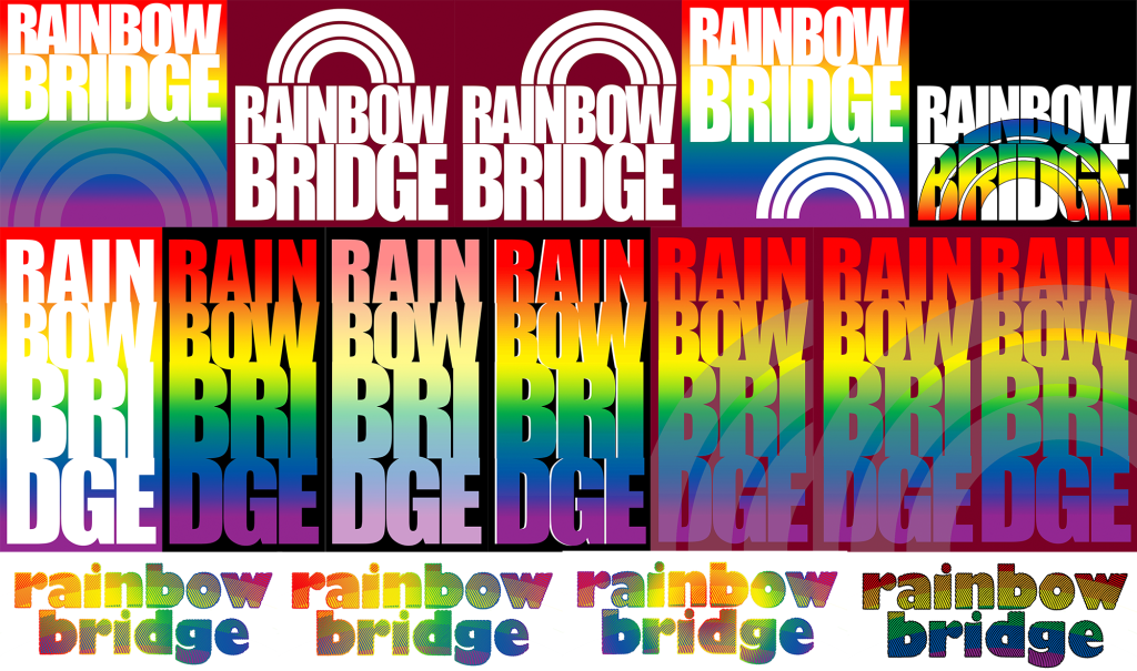
The first few attempts were bold and blocky, maximizing the real estate that the letters took up with a nod to the shape of the arc. There are so many rainbow logos out there, I was initially hesitant to use an outright rainbow in the logo. The next iteration was inspired by the early renderings of the project, stairs and contrasts became the focus.
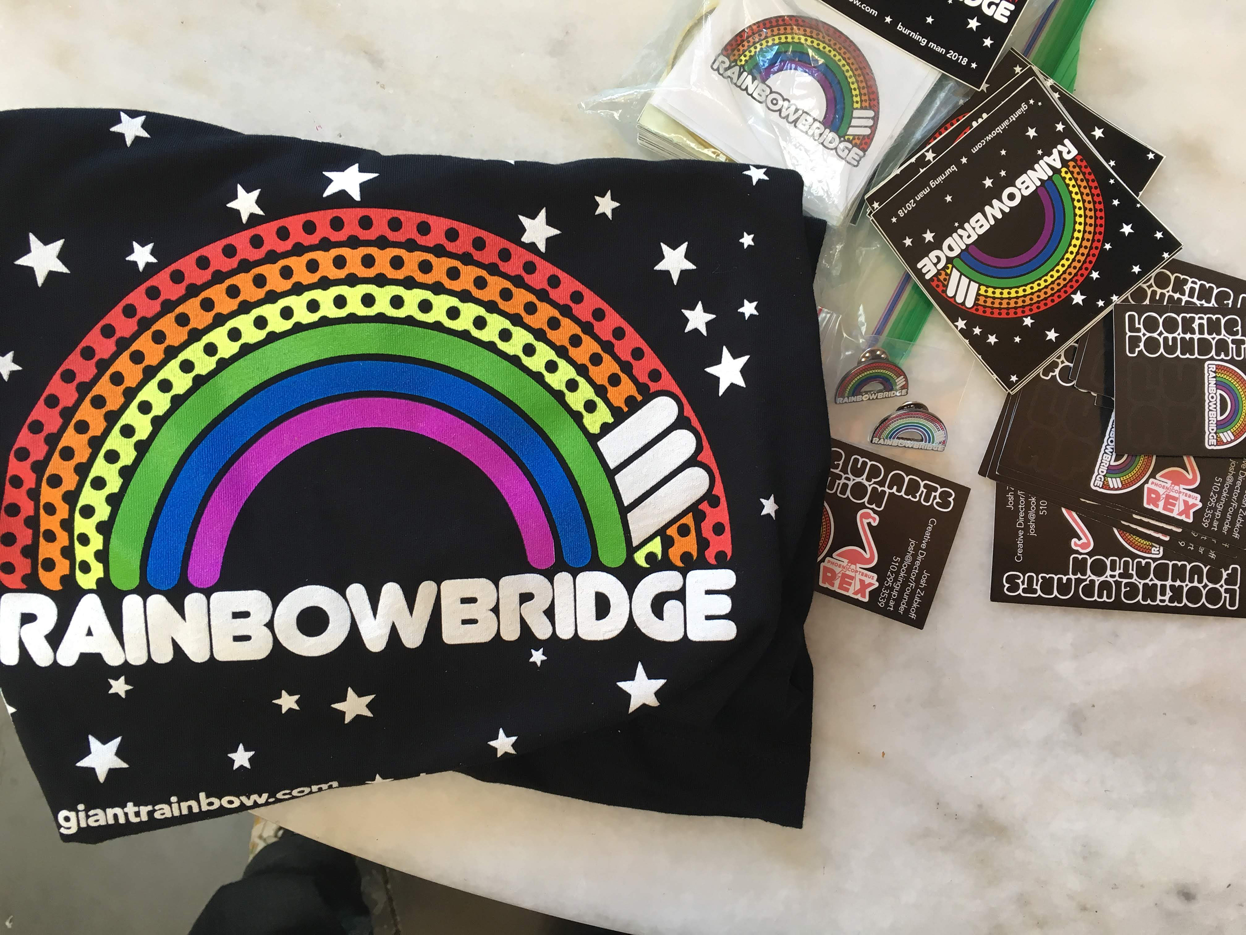
Rainbow Bridge has a lot of interesting design challenges to overcome and I wanted to highlight that–many Burning Man artworks are only striking during the day OR the night, I wanted both, but ultimately the contrast of having a black background made the bright colors pop much more, then I added stars to emphasize brightness at night.
Four contending designs came out, nicknamed: 3d, Cheese-Round, Dots, and Loops
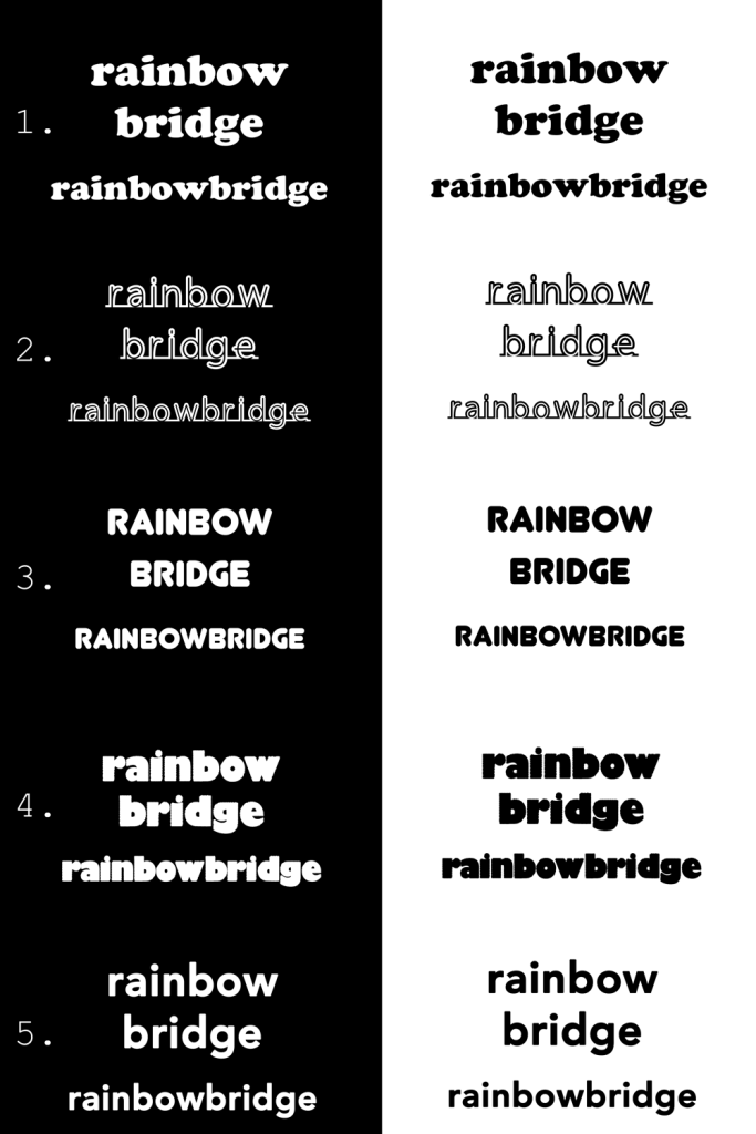
At the same time I was trying to sample fonts and narrowed it down to five. Avenir, Cooper, Fortrack, Junegull, Moare
I put together a google form survey and sent it out to about 20 people to elicit unbiased response, but I already had a strong leaning.
Cheese Round has started off as a very flat, bright, semicircle rainbow. Since the Rainbow Bridge is a semicircle (though less than half a circle), this design emphasized the simplicity of the structural design. While this piece was initially inspired by Japanese bridges, I knew from day one that the keystone part of the design was going to be ever important. In building a large span like this, maintaining as close to a perfect semicircle was going to be critical for structural integrity.
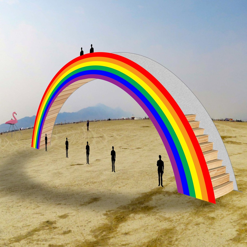
Stairs started out in the 3d design and I liked how they emphasized the climbability. Bringing the stairs over to Cheese Round helped break up the flatness of the design, but the two sets read somewhat as ‘wings’ and were distracting. I narrowed it down to one set of stairs which was enough information to read as climbable, but a bit quirky and asymmetrical.

Dots was inspired by the LEDs. I played with a lot of arrangements and really felt like this design would be great in print, and would be cost effective for silk screening, but ultimately I felt that this design was a bit bland.
The dots made their way over to Cheese Round and I halved them, with three stripes possessing dots and three stripes having none. This solved the flatness dilemma I was facing, which was how I could have the flatness of the design I wanted, while suggesting that this was in fact a three dimensional design with two separate side with the dichotomy of being a boldly painted rainbow in the day and brightly lit programmable LEDs at night.
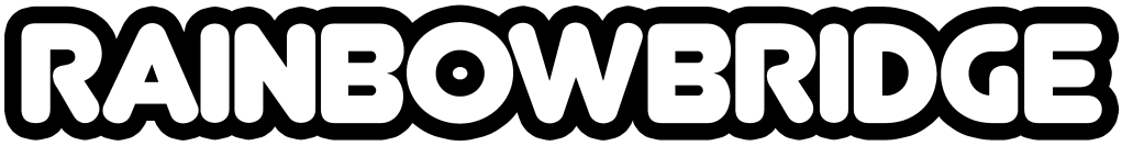
While trying out the different fonts, I began leaning toward Junegull. With the idea of a nighttime black background in place, I used white font and made many subtle changes to the kerning. The “O” in the text was evocative of the semicircle arch and I was smitten. The semicircle ends of the font led to me rounding the edges of the rainbow and the stairs. I was done. Almost. A week earlier I read an article about intentional asymmetries in the Starbucks logo and I want to add some quirks. A few fun flaws later and the Rainbow Bridge logo was done.