I did a few rough out of several concepts to highlight aspects of the project and use those as design elements in the logo:
· Leaves
· The “crown” of roots at the top of the structure
· Natural roots
· Geometry of overhead view of structure
· Fire
· Feathers
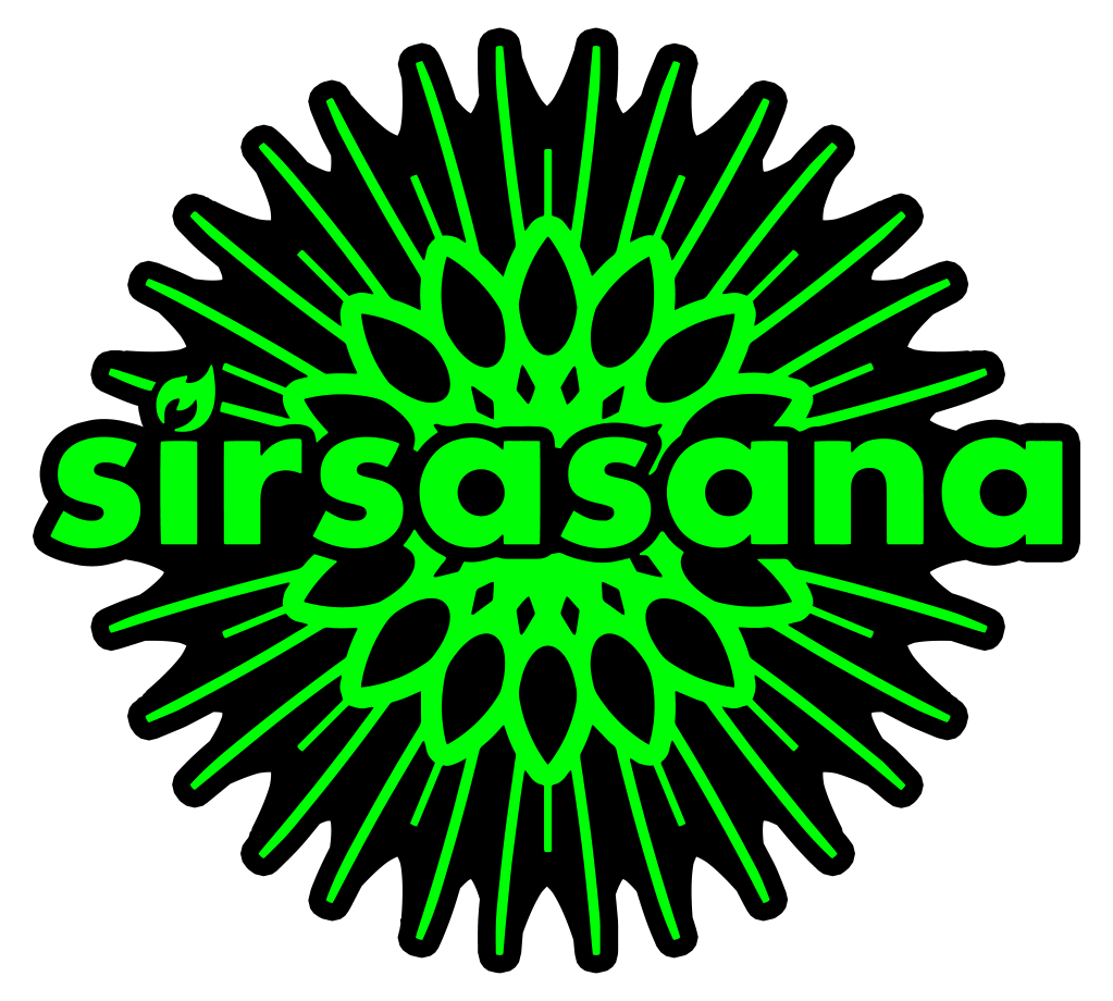
At this point the project was in the secondary design stage where the primary structure was mostly unchanged, but the second tier seating had been changed to leaf shaped platforms. I used top and front parallel projection of the second design to get the silhouettes of the structure used in the logo proposals. Whereas there was a third redesign was underway that ultimately became the final structure, I didn’t have access to it yet.
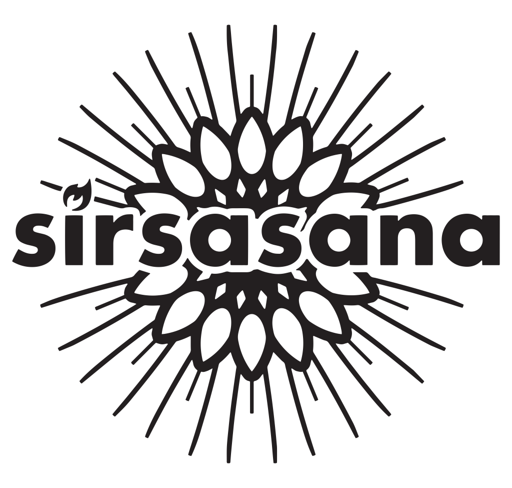
Futura for the font was initially a placeholder, but worked well enough that we got a little sentimental for it that we kept it all the way through the end.
The initial feedback was negative toward the sharp front views of the crown. In any position, top or bottom it felt confusing and harsh. While I enjoyed the big energetic swoops, it had too many sharp edges and we were trying to emphasize the curves and roundness of the project.
The natural roots were interesting, but they were getting hung up on the lack of clarity–were they roots or vines? Although the natural roots could have been redesigned to clarify concerns, there was an urgency to wrap up the logo to move on to the fundraiser element of the project.
The two that made it to the next round were the simple leaf swoop and the overhead view.
The interesting thing about the simple lead swoop, was that it was being read more as a flame than a leaf, so I redesigned it to make it significantly more flame-like. Under encouragement from my teammates, I increased the background image to full width and integrated the ‘flame’ into the mix.
At this point the design was really coming together and I did minor adjustment to the kerning since hovering over the background image has a few interesting quirks.
The design was more or less done at this point, but I wanted to squeeze in a few more details, so I made a ‘leaf’ version, a ‘feather’ version, and a ‘leaf and feather’ version. While I was excited by these spinoffs they were rejected and I started the process of cleaning up the logo and finalizing it.
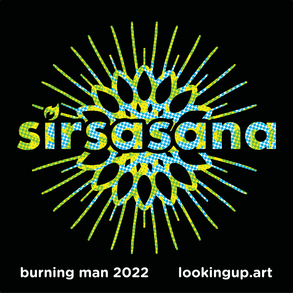
We did an initial run of stickers and wanted a splash of color, but the printer was CMYK which was a new experience for me. The ask was for something bright and a bit psychedelic but abstract enough that wouldn’t contradict any design choices we would end up making later.
The stroke on the patch needed a special treatment to have correct spacing that would accentuate the spires without entirely filling in the background. The grooves between the spires alternate in pairs, so a fully regular shape wouldn’t quite work, so I used the photoshop polygon tool with star ratio and overlaid that on the stroke.